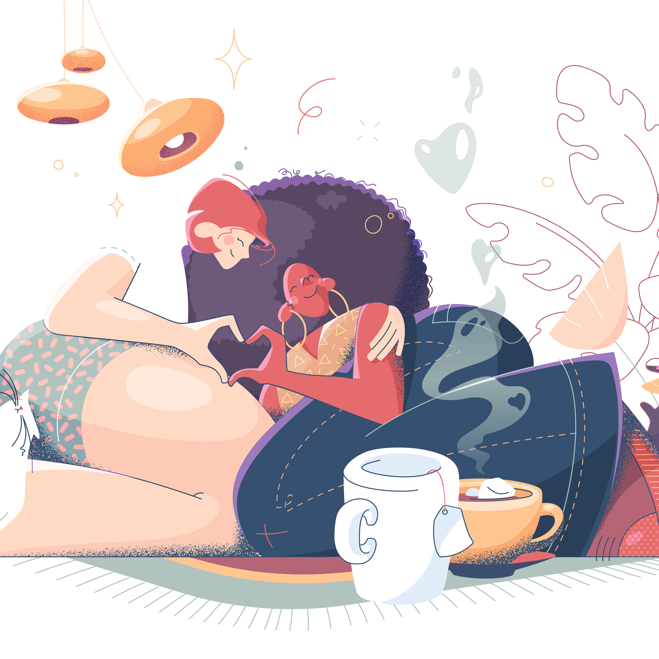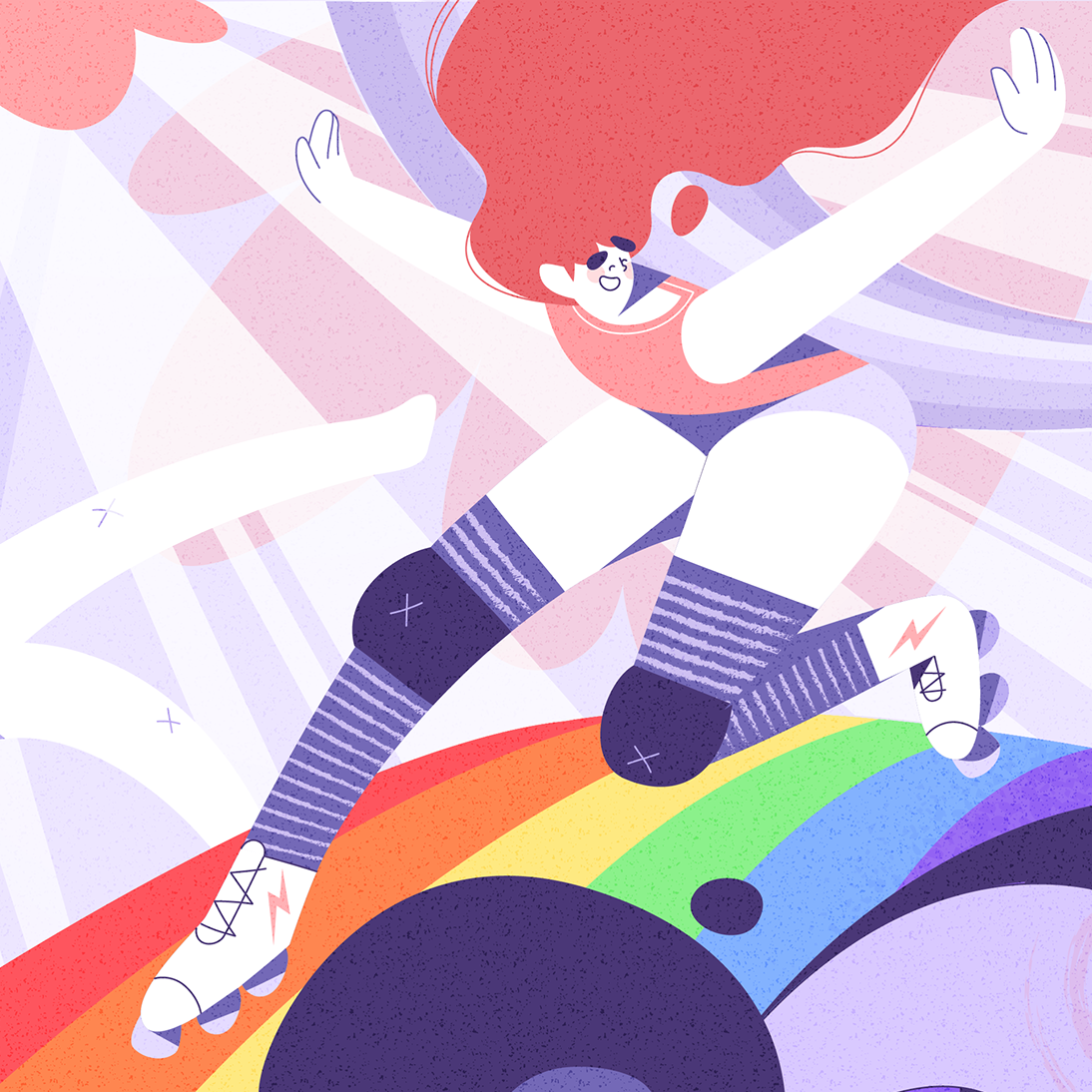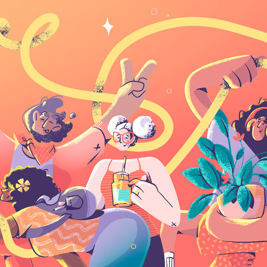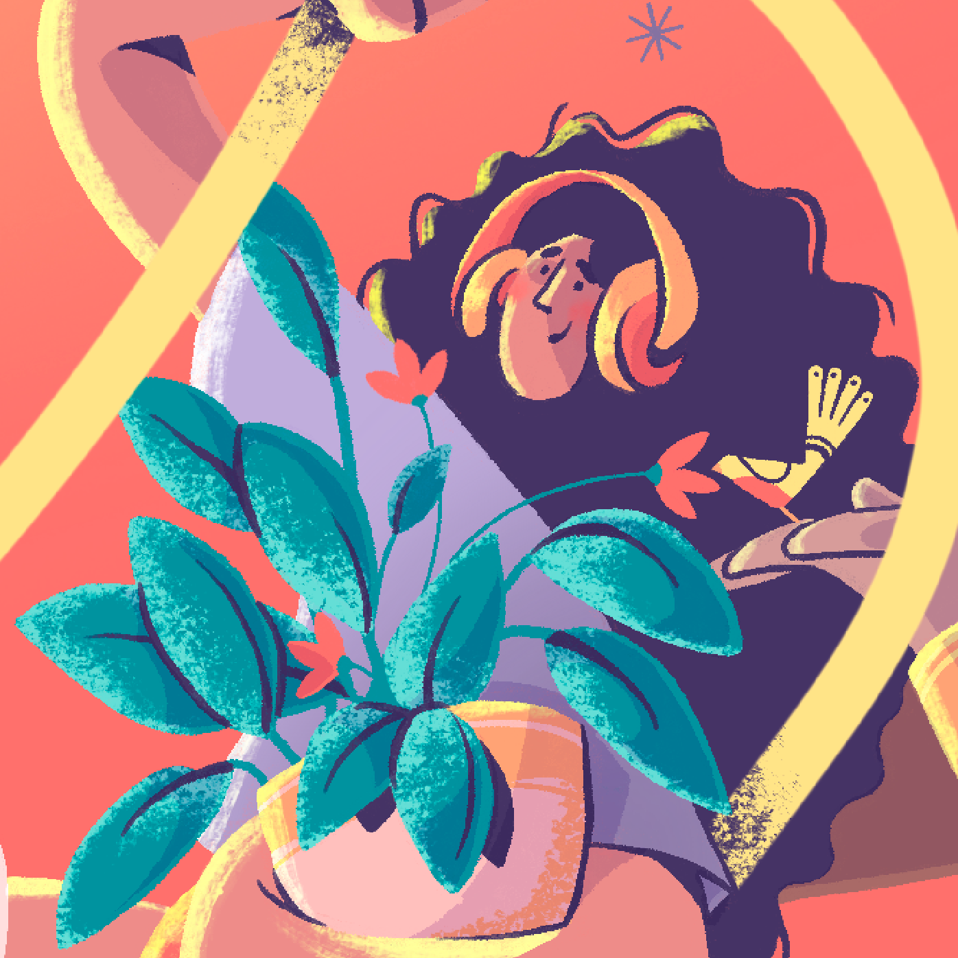
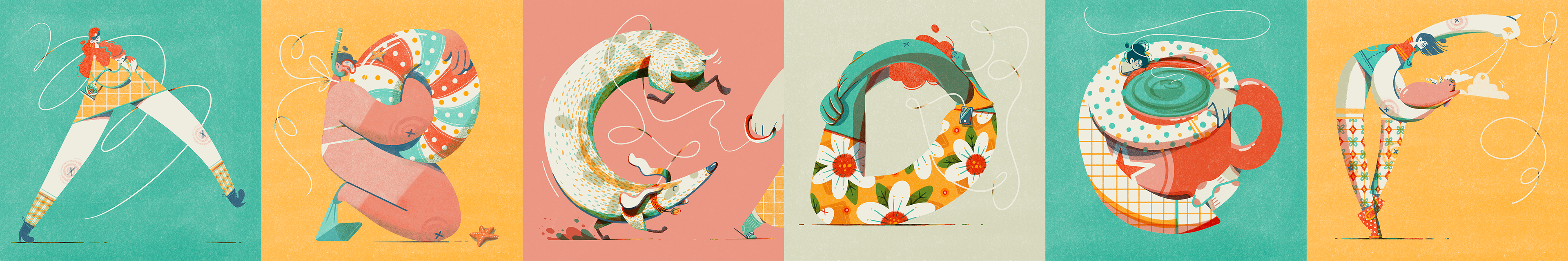
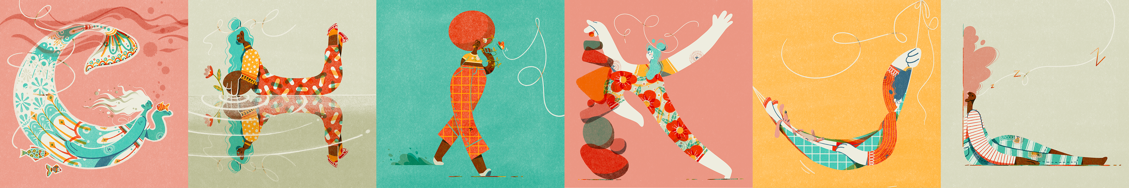
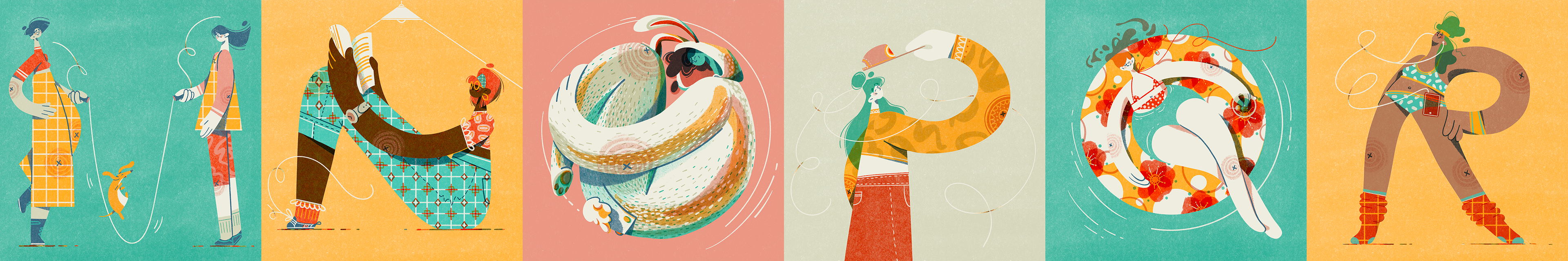
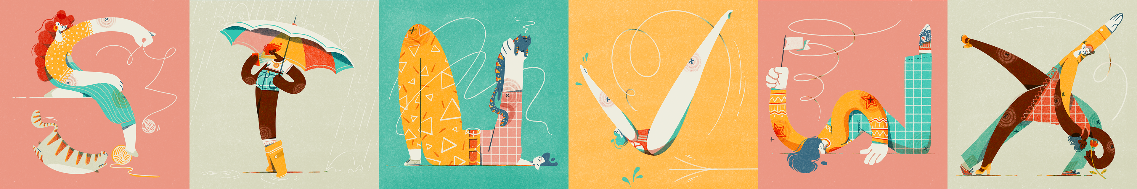
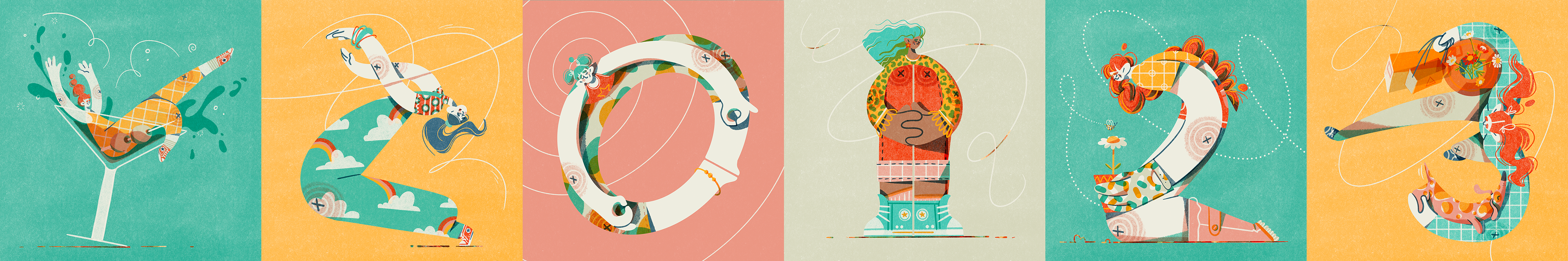
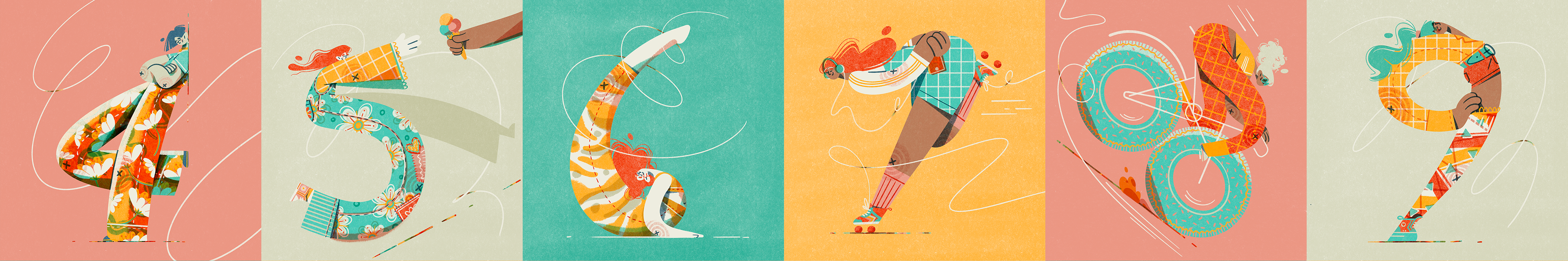
For my second 36 Days of Type challenge, I illustrated a set of female figures in the shape of each A-Z letter and 0-9 digit.
Challenge
The annual global design challenge is to create a cohesive set of 36 letterforms in as many days. My goal this year was to loosen up and have fun with my character shapes, opting for expressiveness over anatomical accuracy.
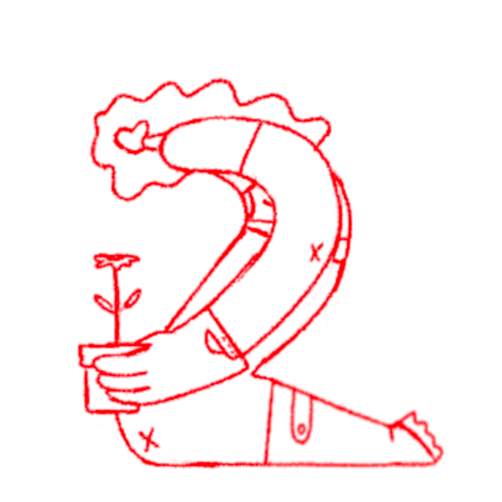
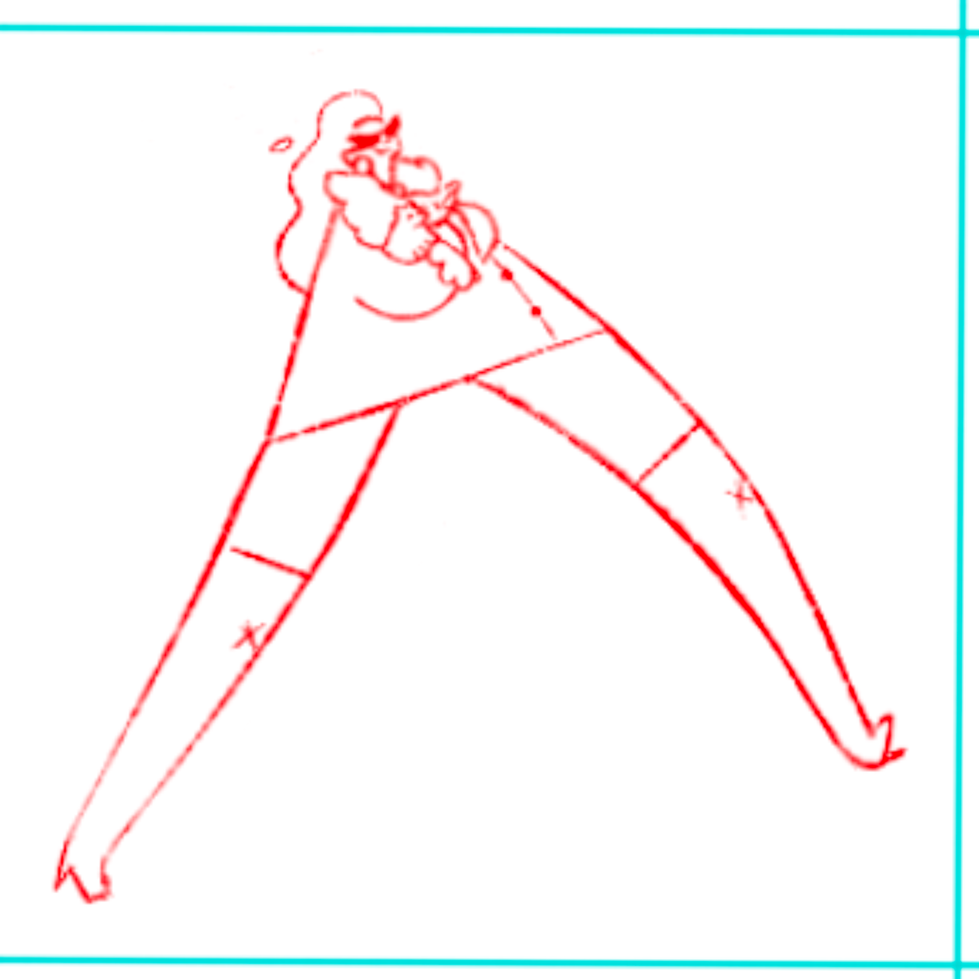
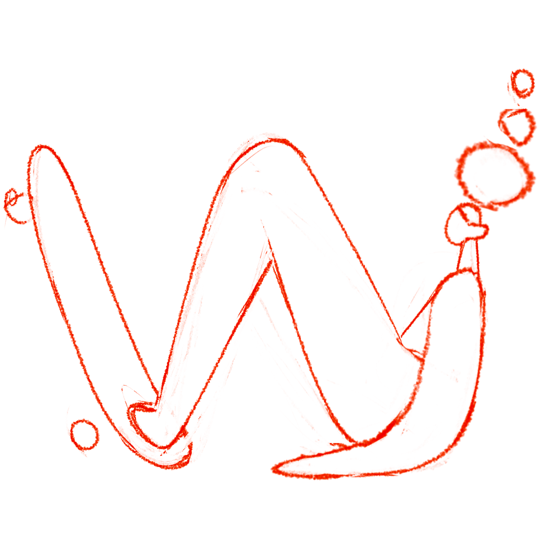
Rough thumbnail sketch
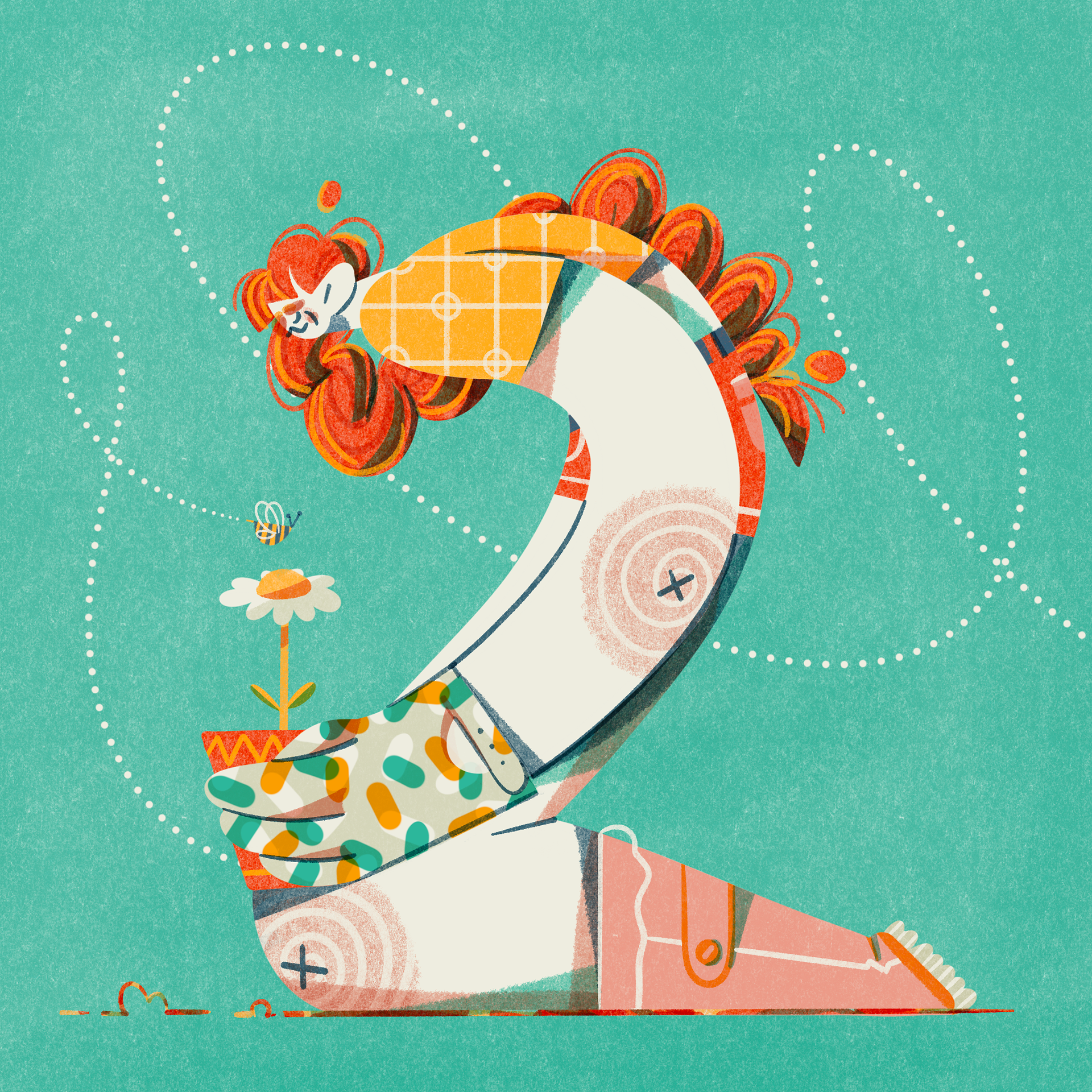
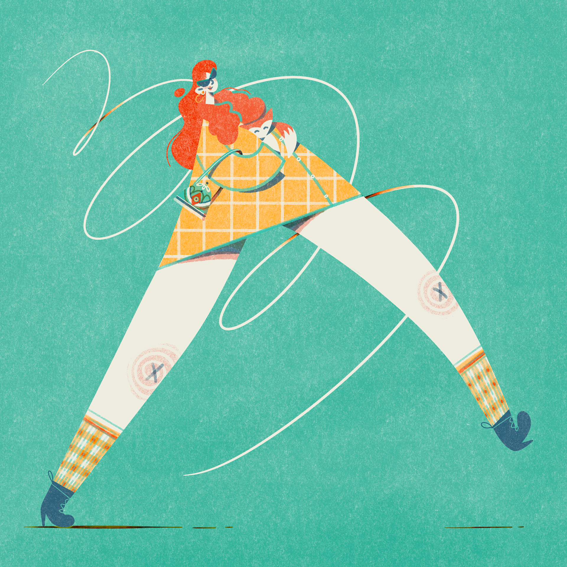
Colour final
Timelapse colour process
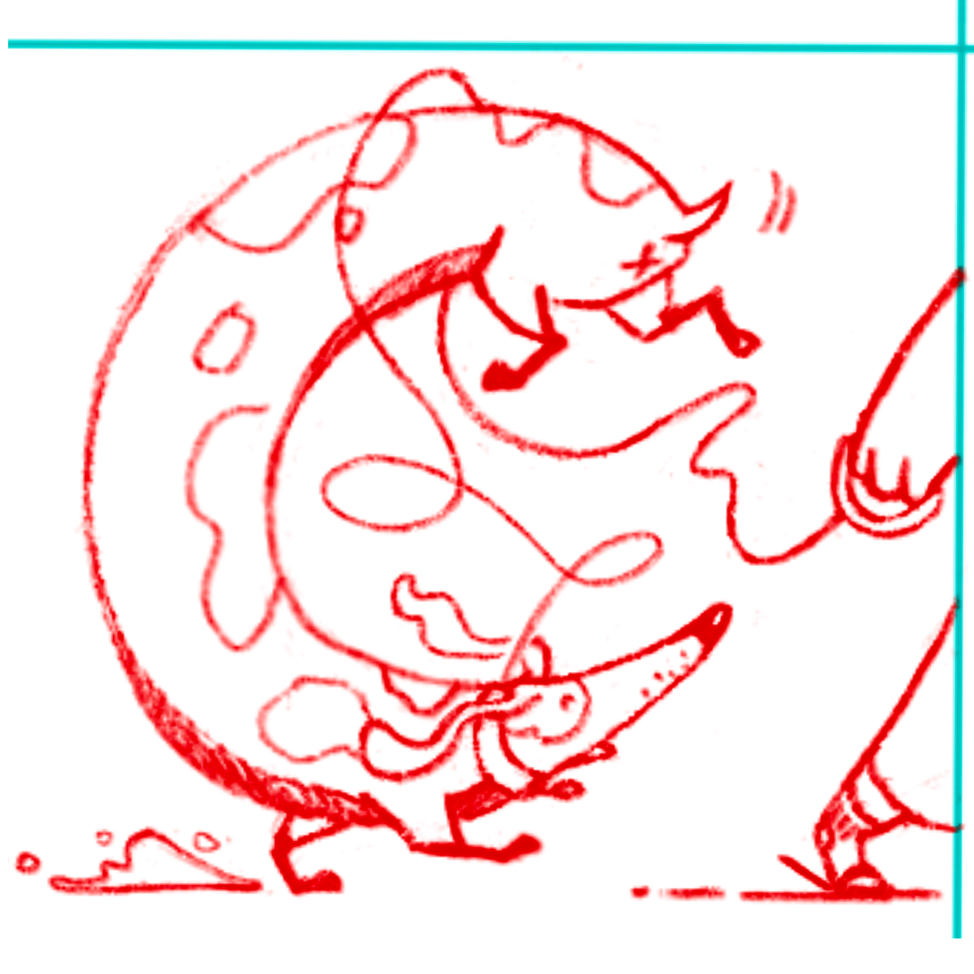
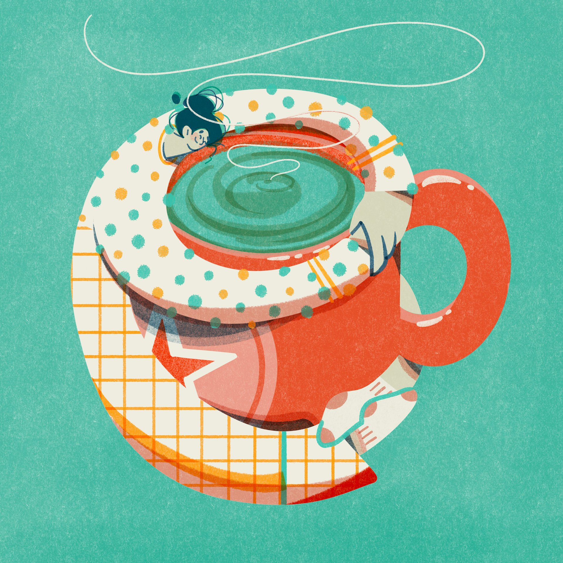
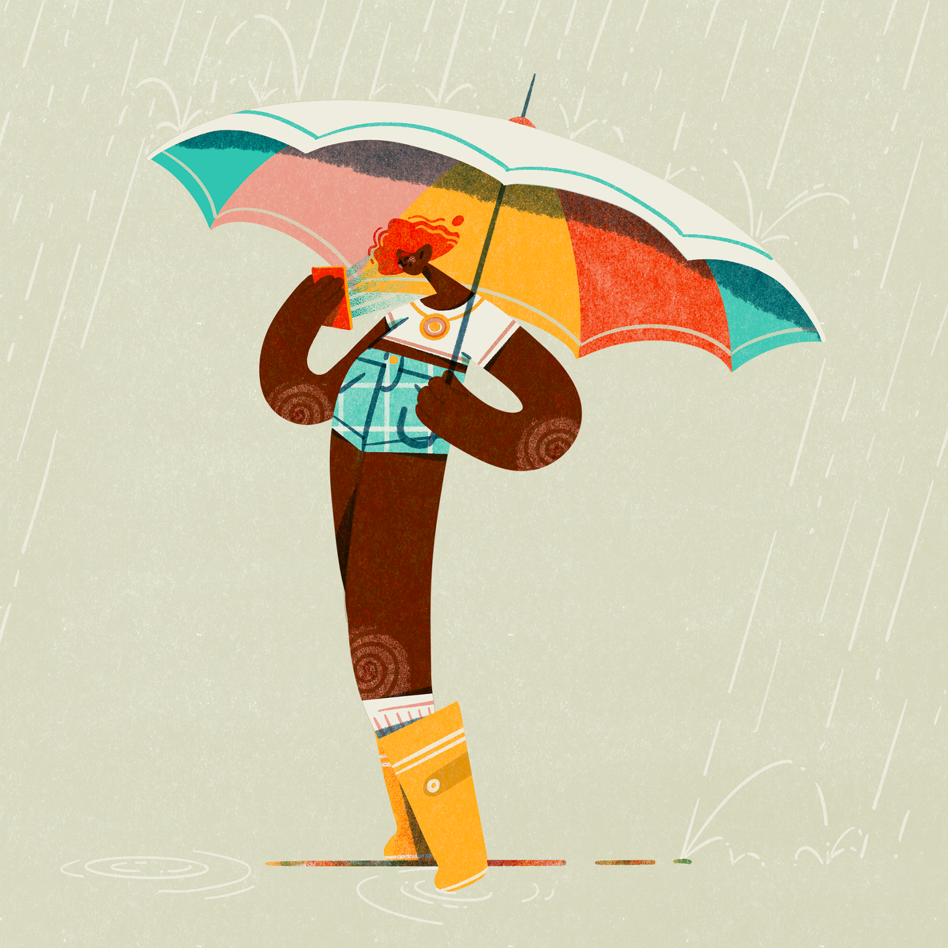
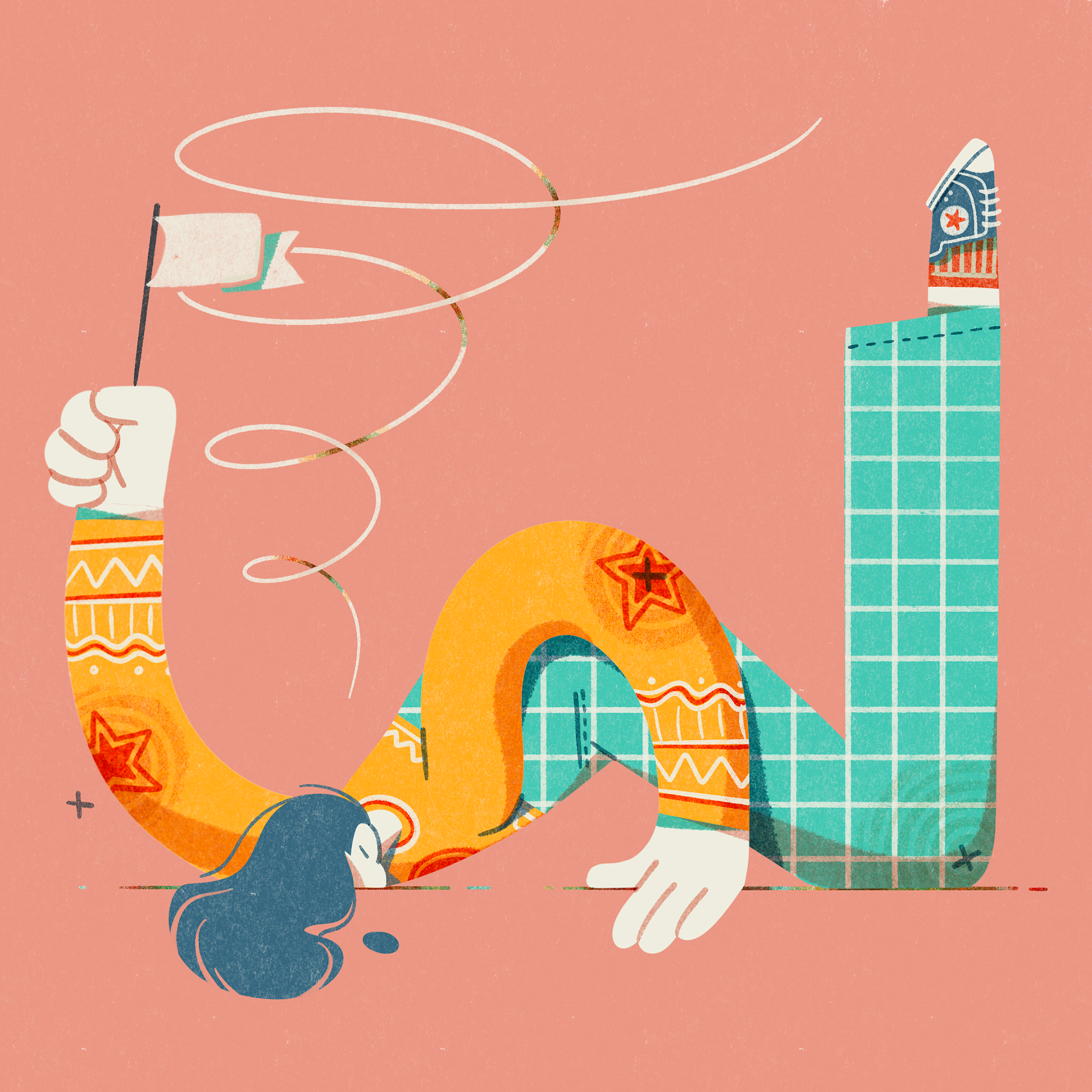
Thumbnail sketch
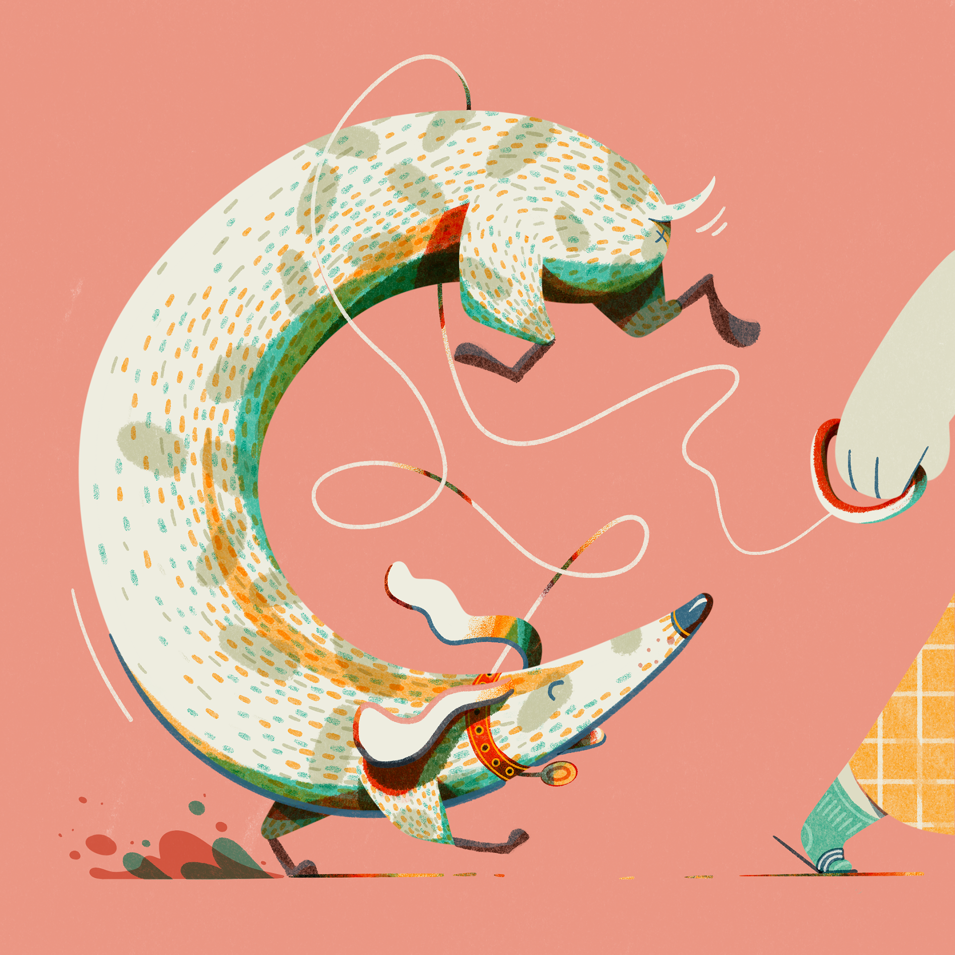
Final colour
Timelapse colour process
Solution
I started with rough thumbnail sketches in a 6x6 grid to jot down my initial ideas. When I was happy with the basic concept, I transferred the small sketch into a new document, enlarged it, and refined it, adding colour, pattern, and details.
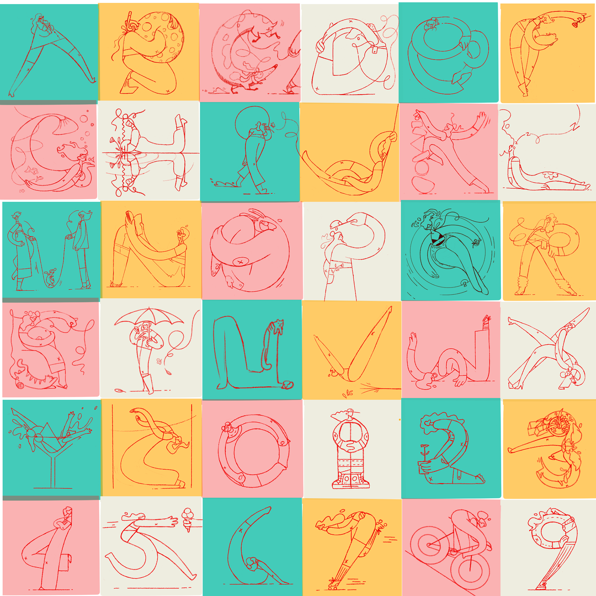
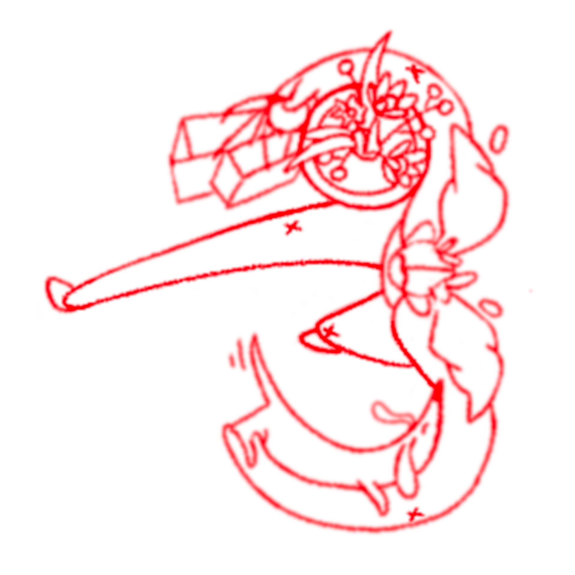
Rough thumbnail sketches
I limited my colour palette to 7 risograph colours using brushes in Procreate on the iPad. This gave me the texture I was looking for, as well as the flexibility to vary the background colours and still create enough emphasis against the different skin tones of the figures.
Rough thumbnail sketch
Final colour
Timelapse colour process
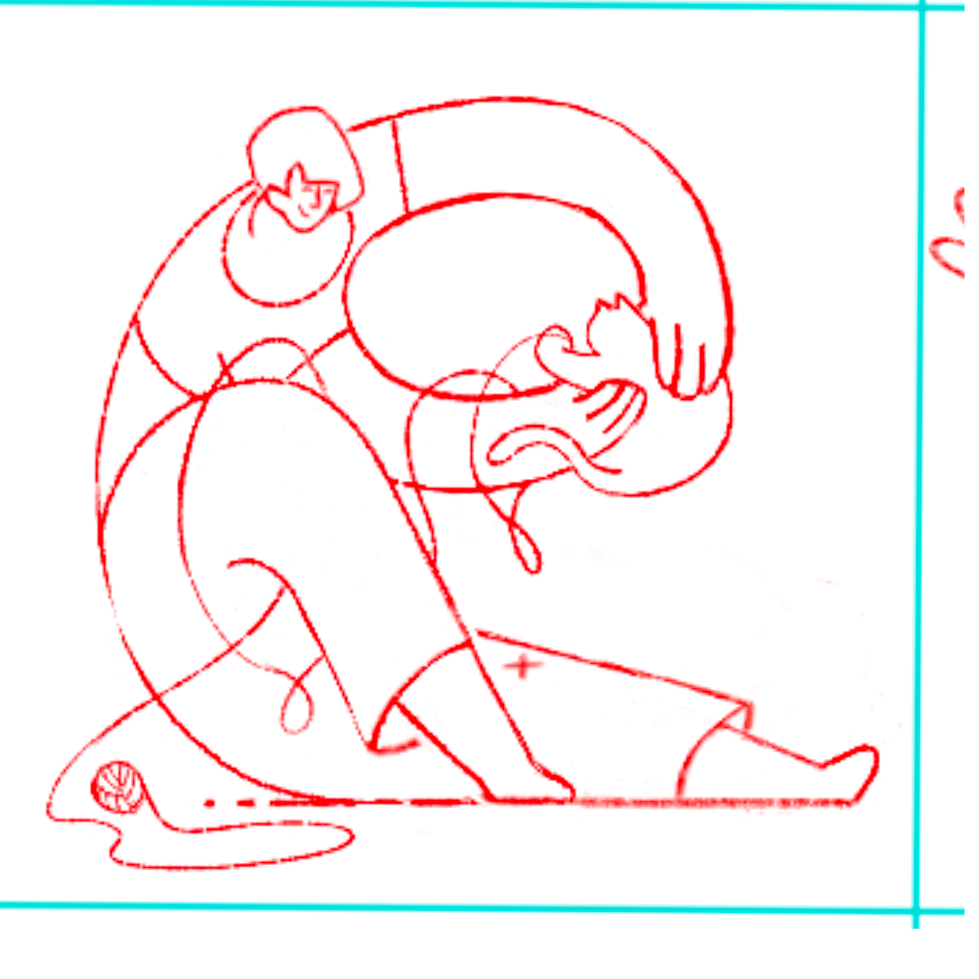
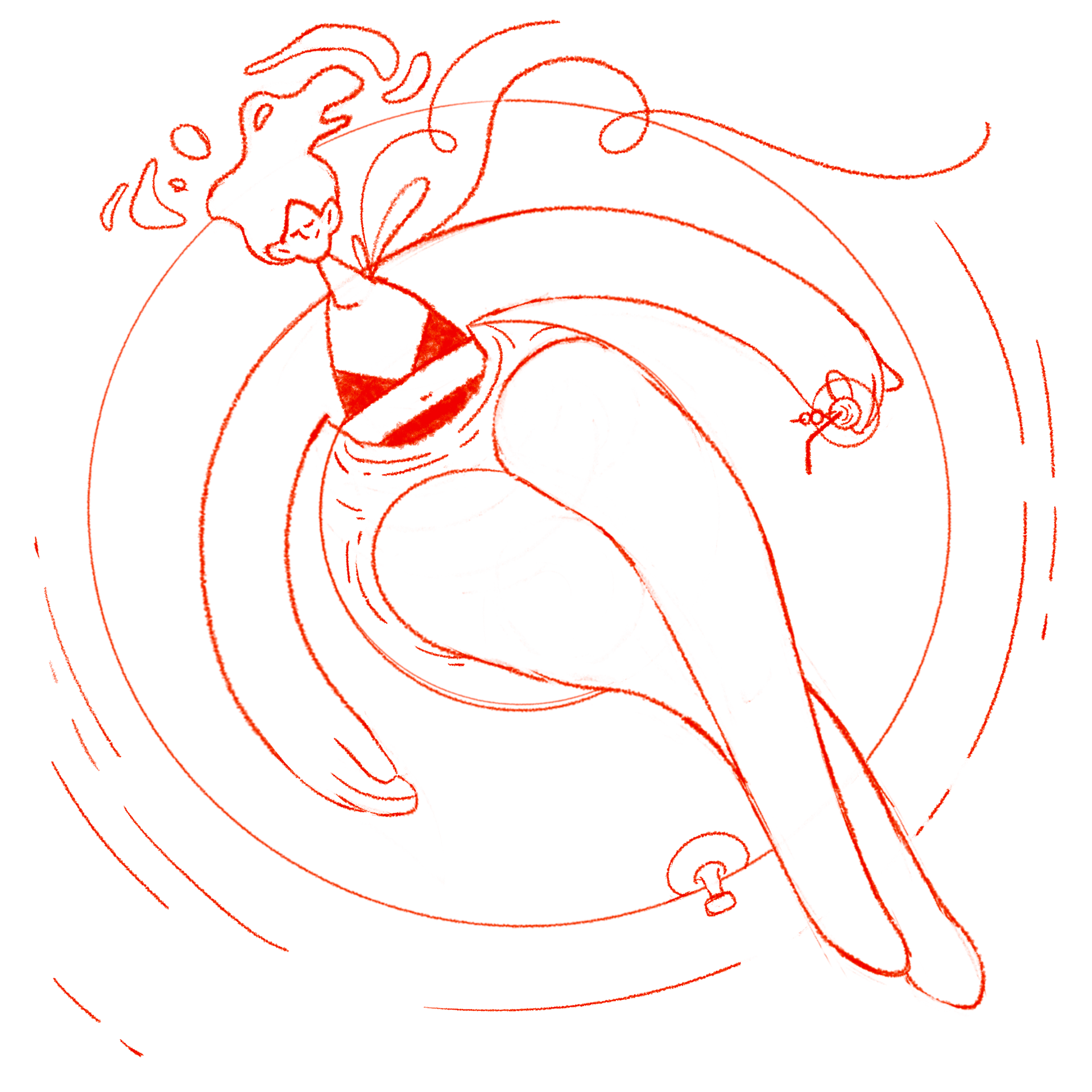
Rough thumbnail sketch
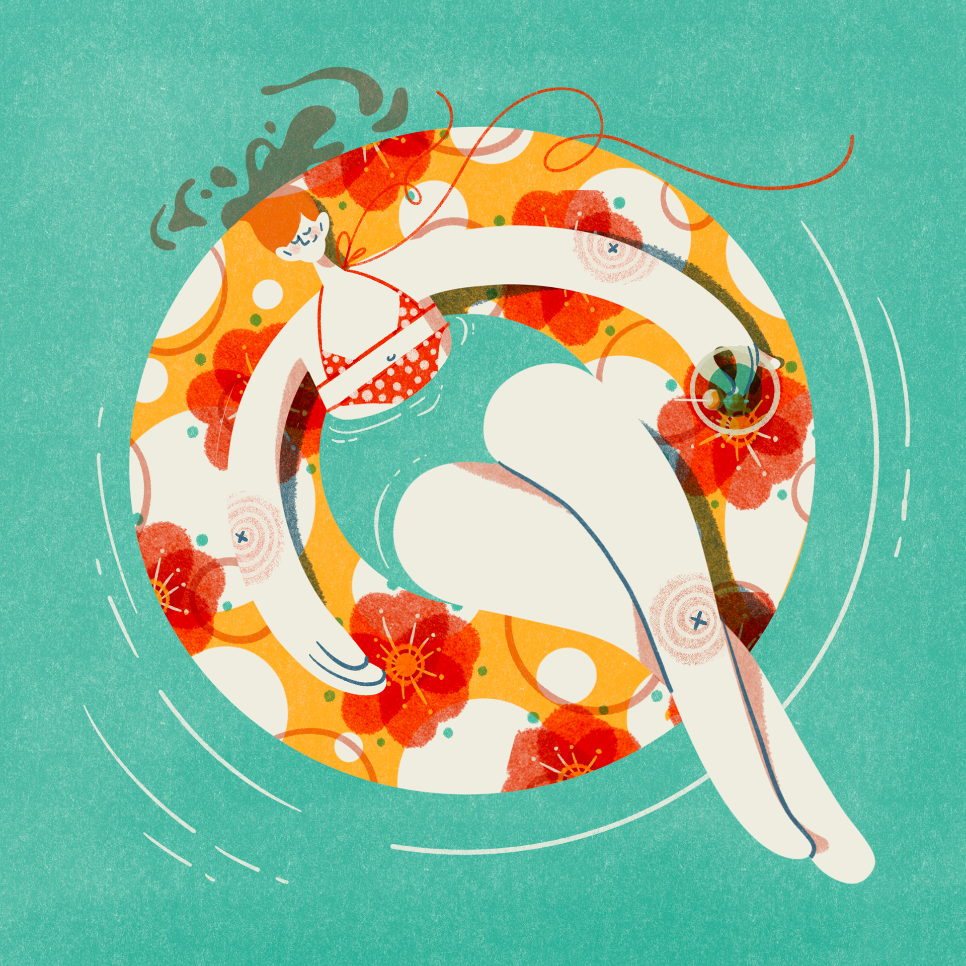
Final colour
1st sketch didn't quite hit the mark
2nd sketch communicated the idea more clearly
Final colour
Timelapse colour process
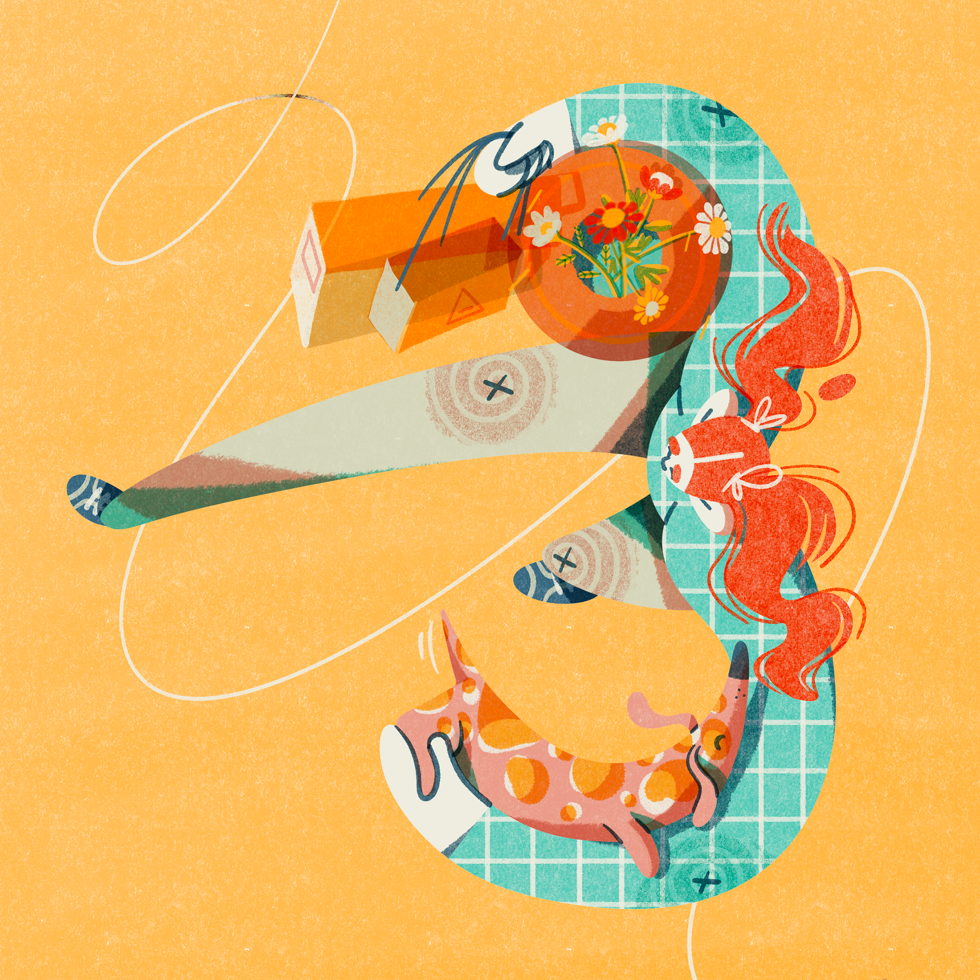
I kept the shapes, patterns, and colours simple and playful – exploring different ways to translate female forms into recognisable letterforms.
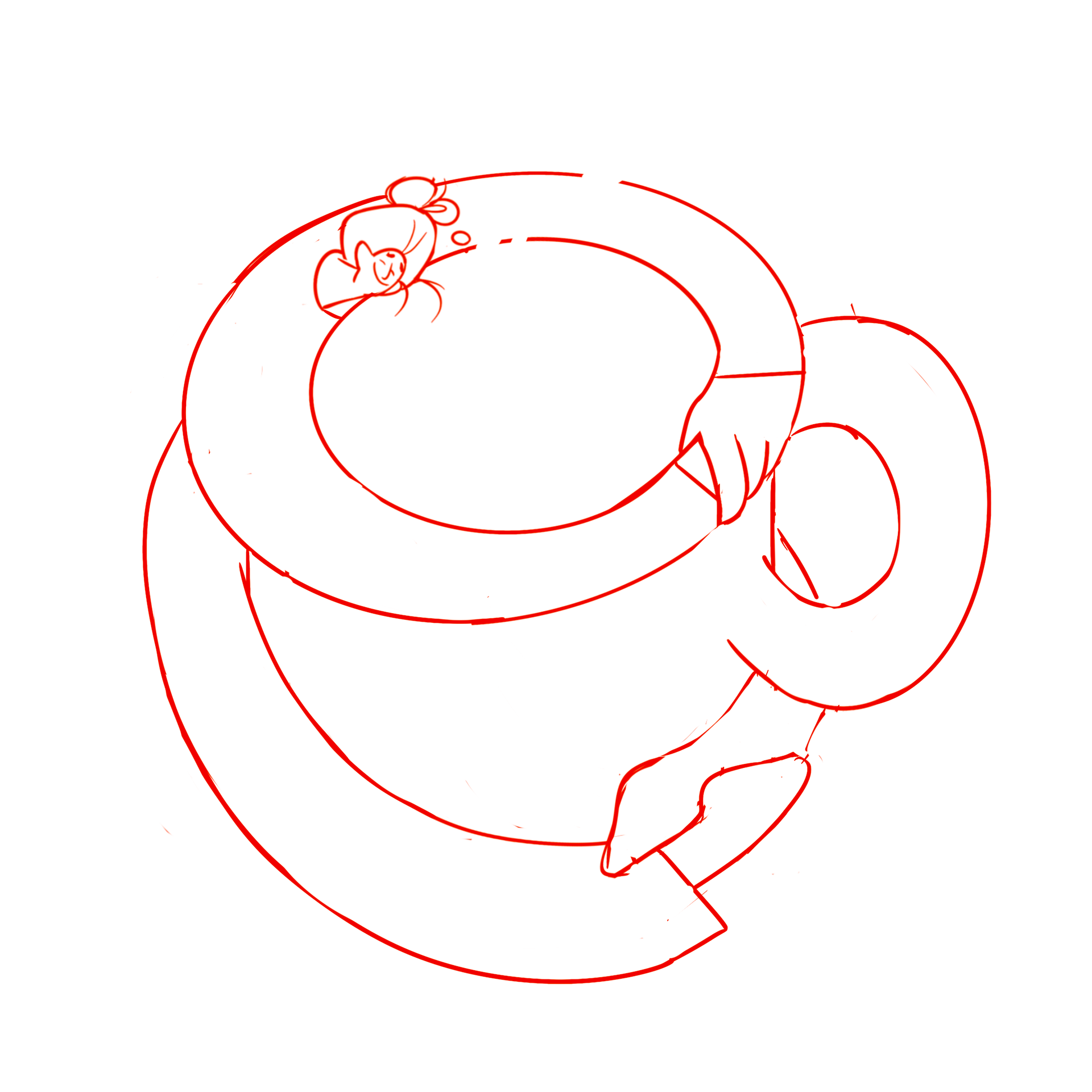
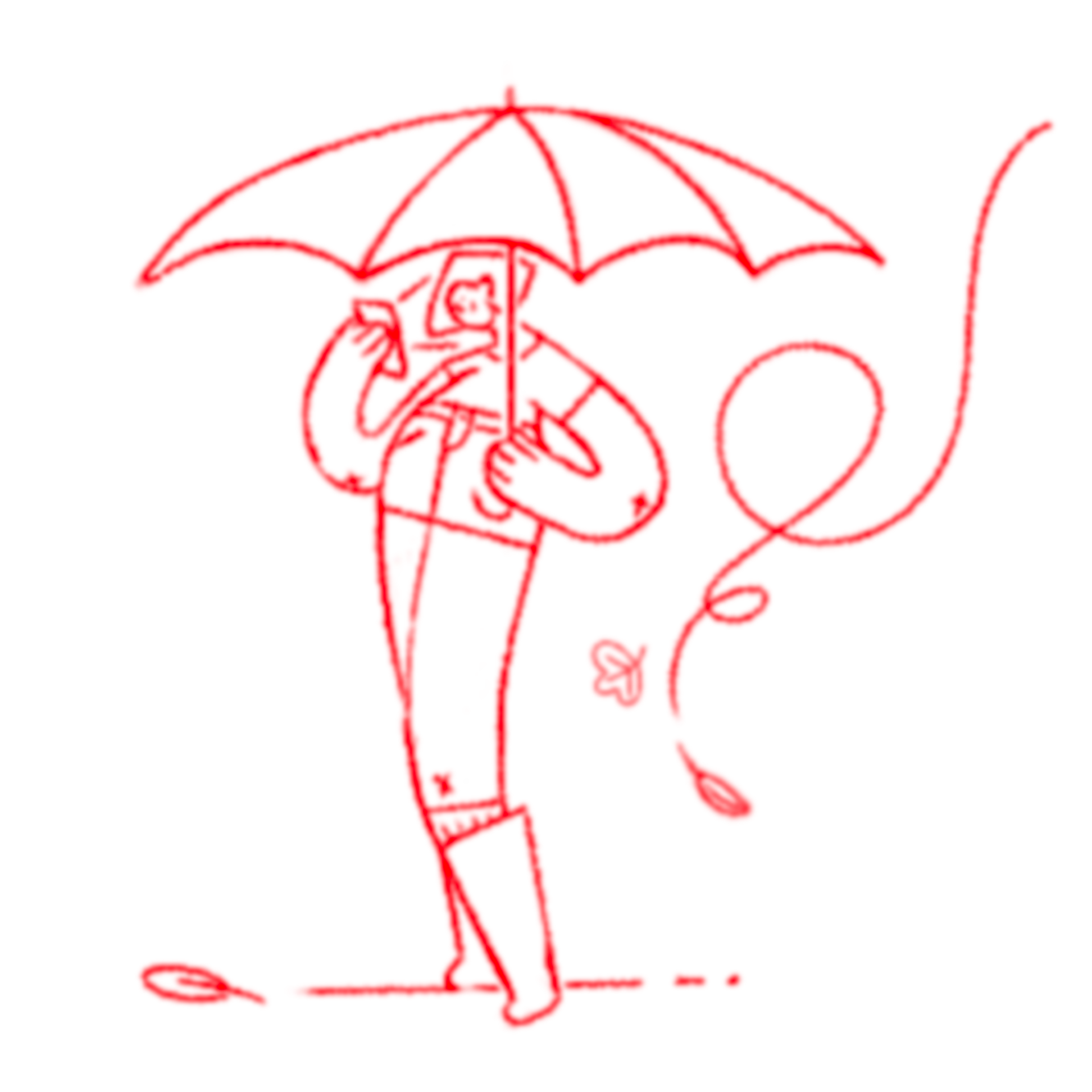
Rough thumbnail sketch
Final colour
Timelapse colour process
Rough thumbnail sketch
FInal colour
Outcome
As I got further into the project, I became more open to pushing the proportions of the figures and exaggerating shapes to make an emotional connection and communicate an idea more effectively. I look forward to using what I've learned in this challenge to stretch my imagination further and explore more creative character designs in the future.
Initial concept was static and uninteresting
2nd sketch had more potential
3rd refined sketch pushes the shapes
Additional flag detail clarifies the message
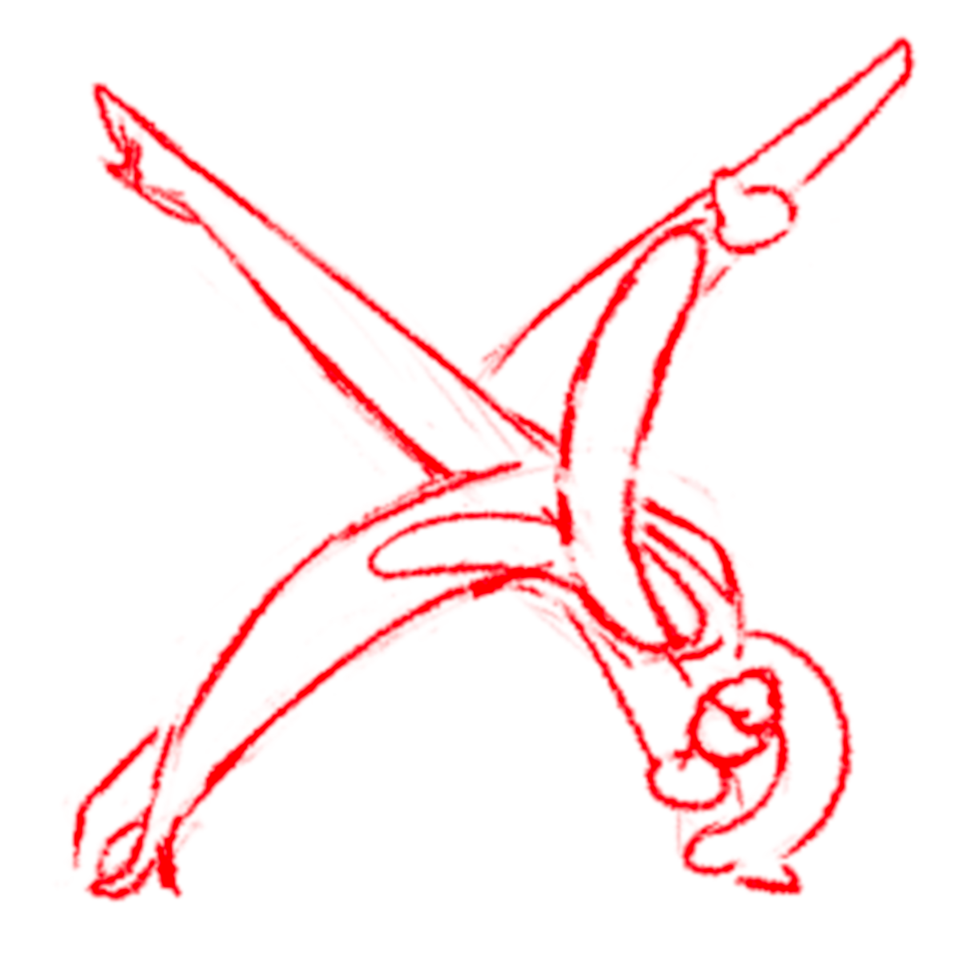
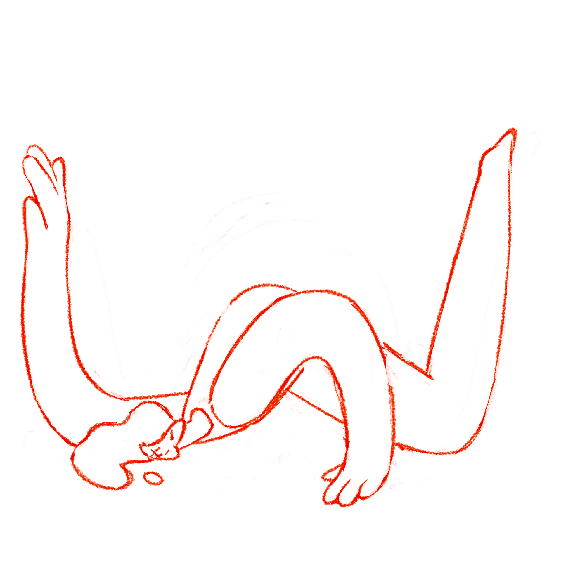
Initial rough sketch
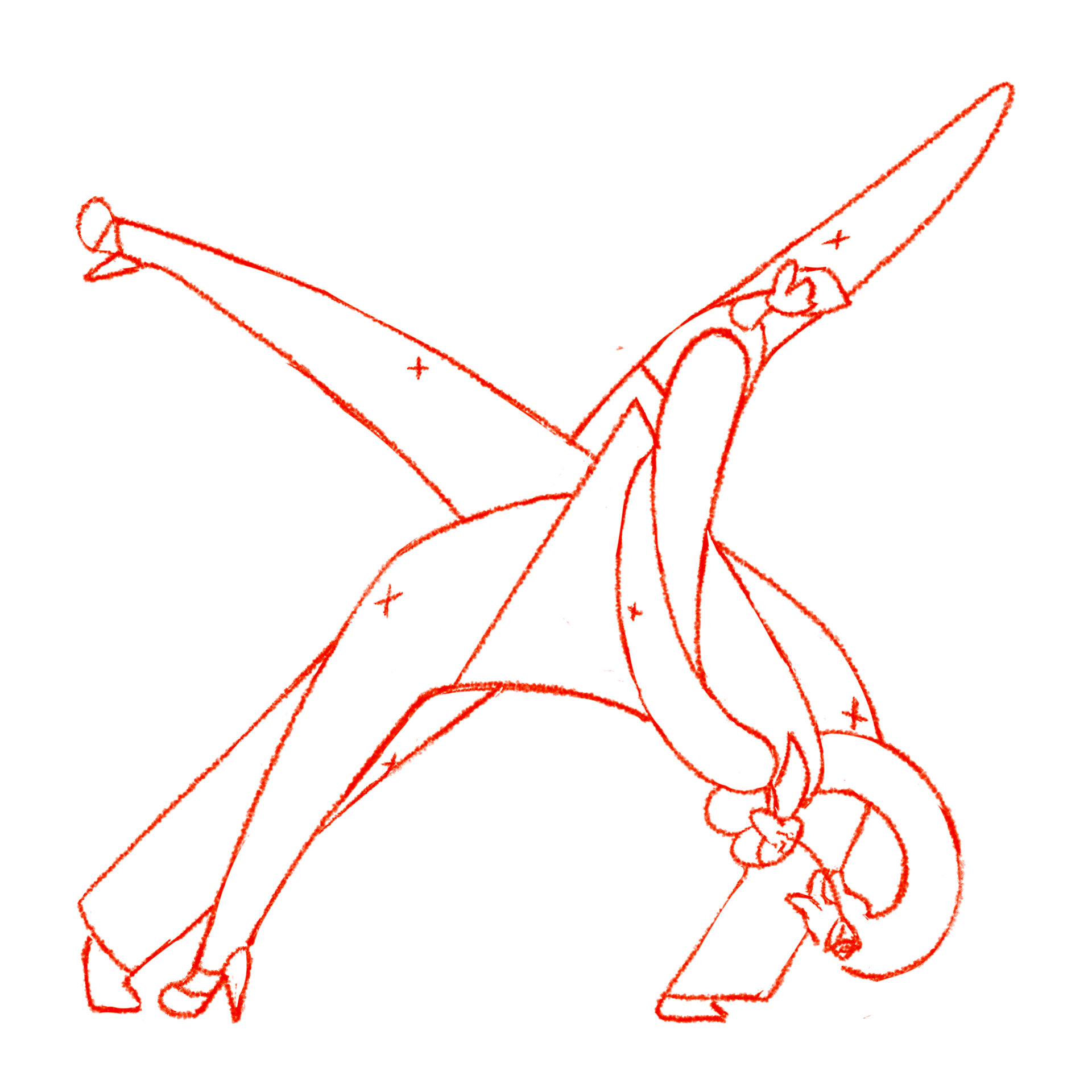
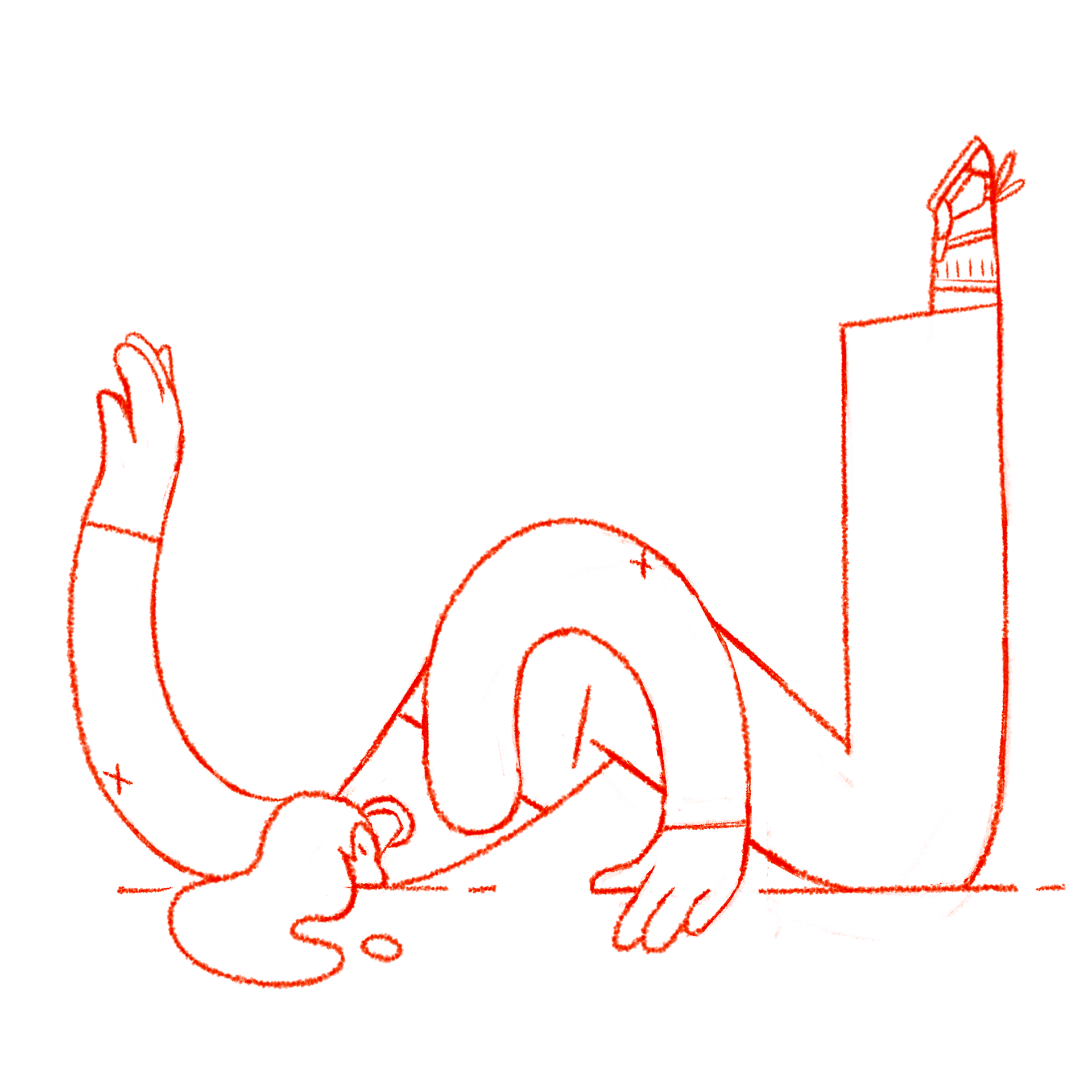
Refined sketch
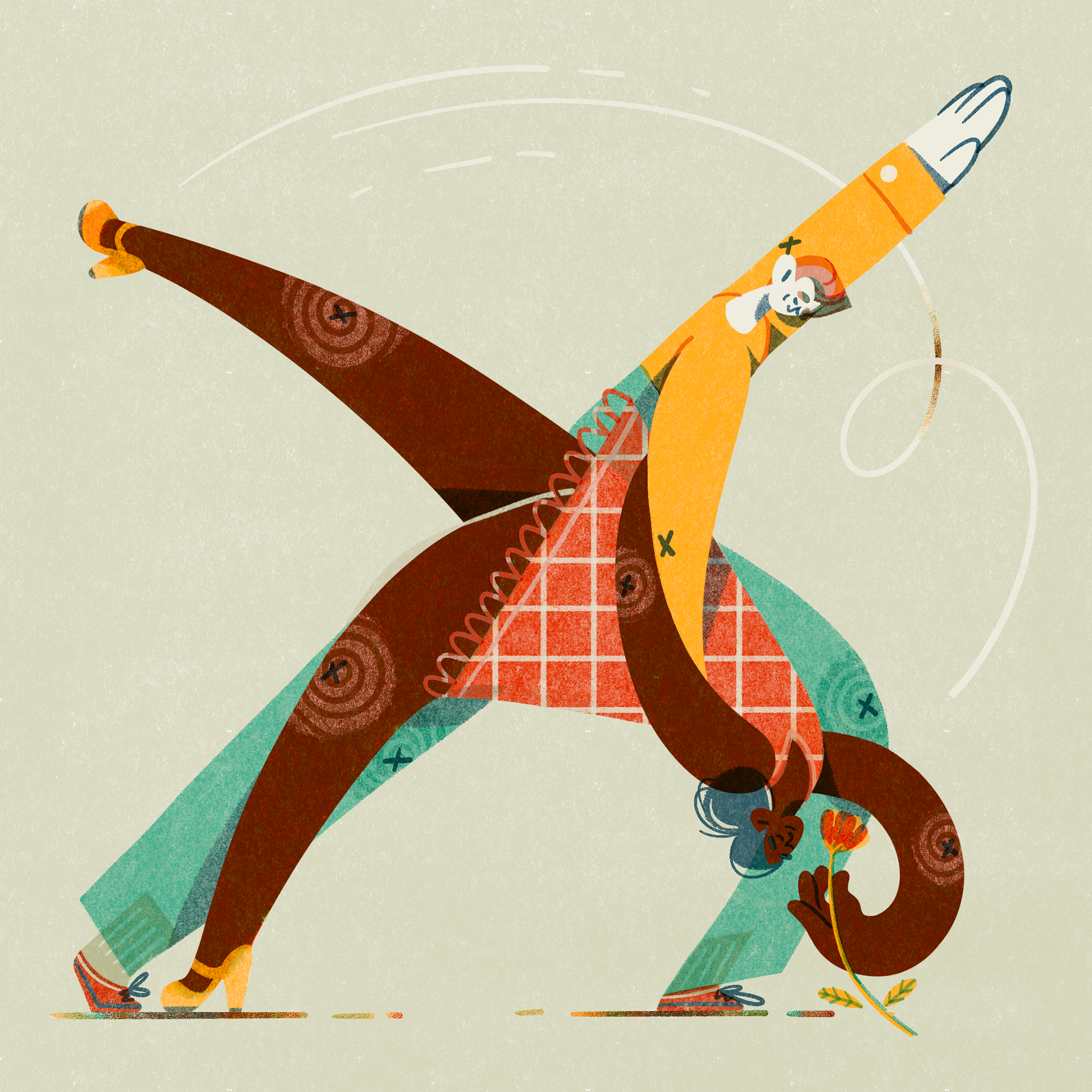
Colour final
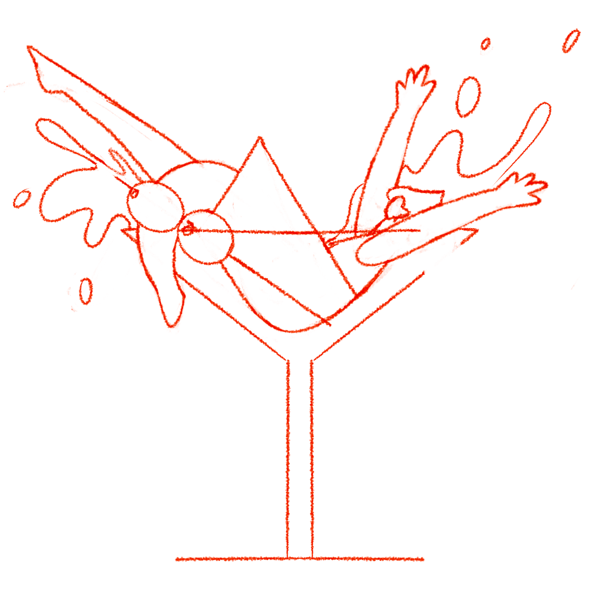
Rough thumbnail sketch
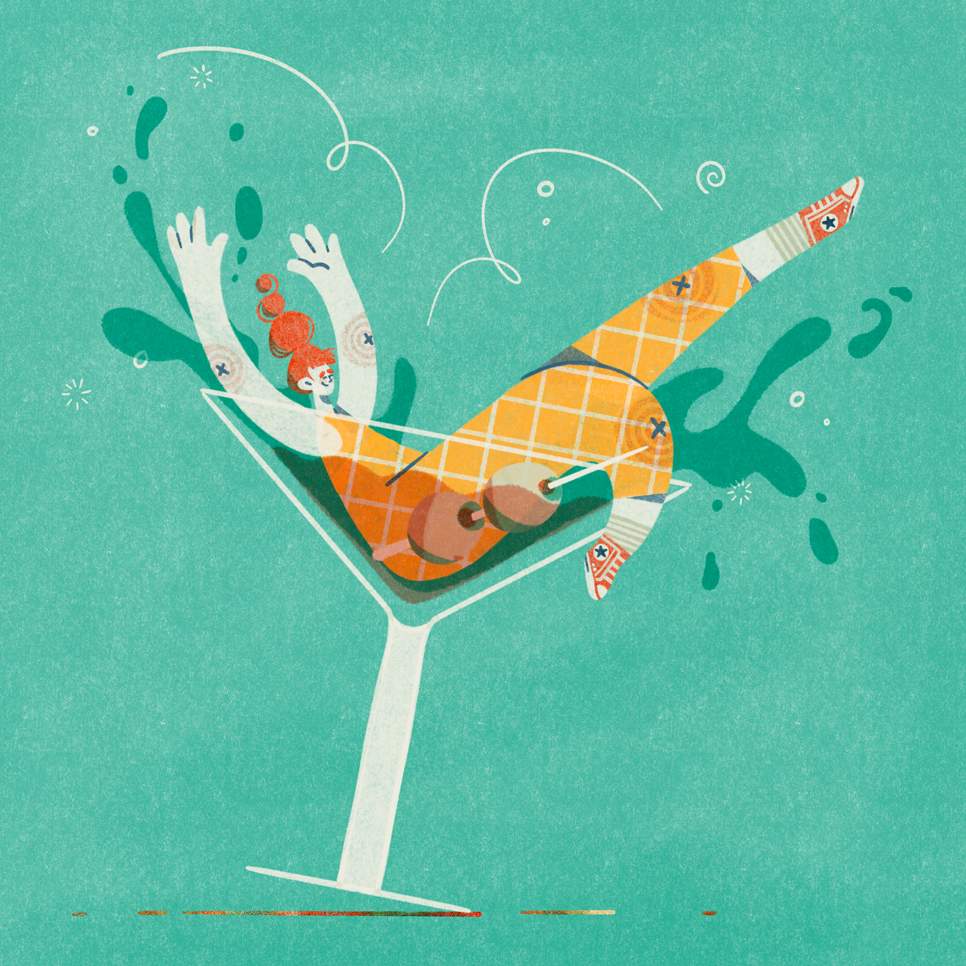
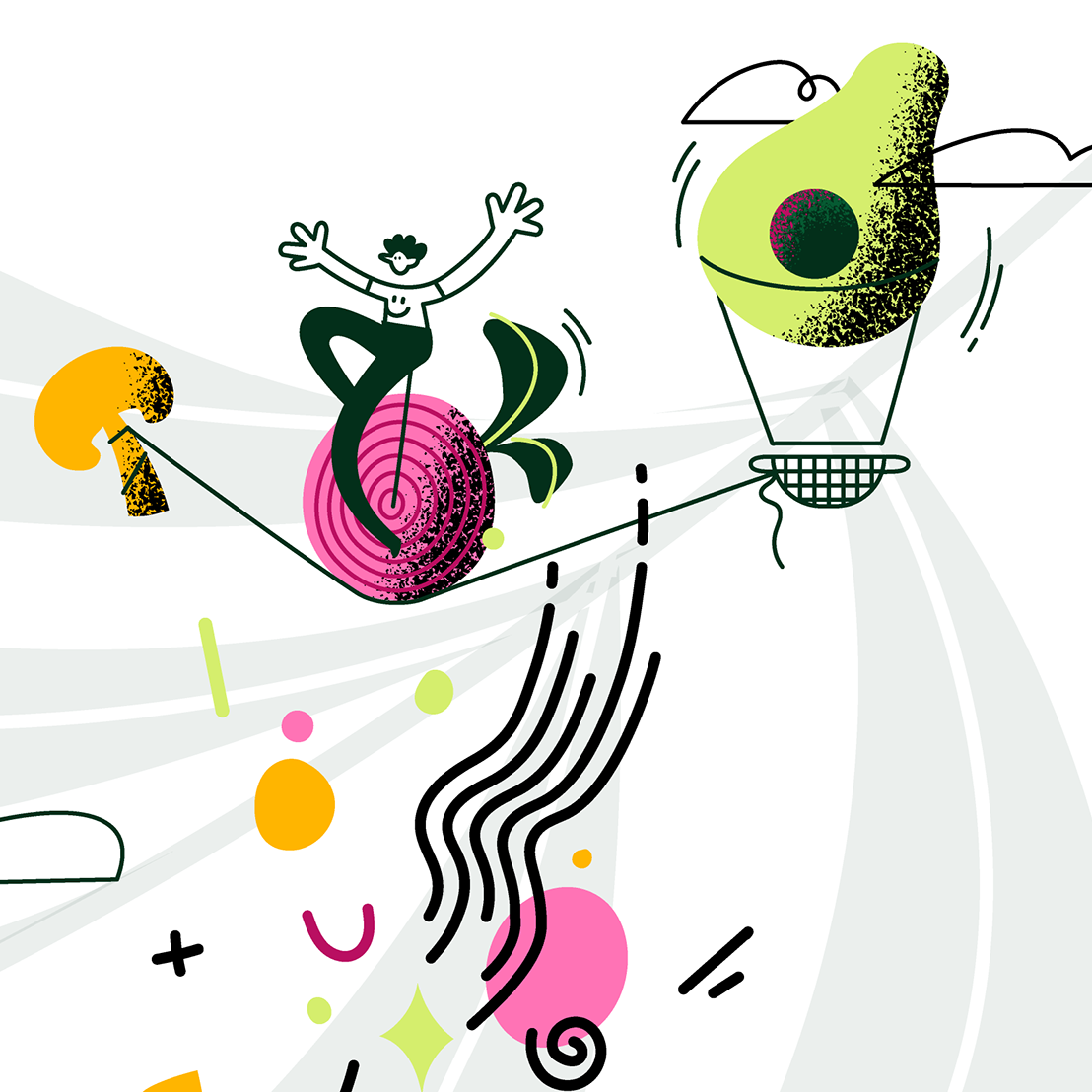
Tipping the glass adds more movement in the final image
Timelapse colour process